
Beauty & Wellness
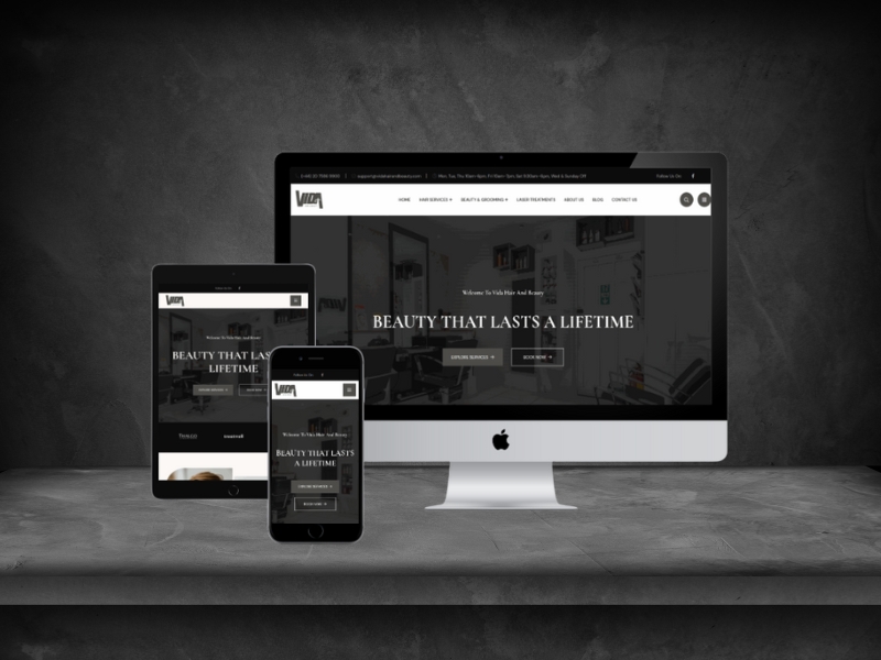
Vida Hair & Beauty Salon Website
A premium salon website designed to present services clearly, improve mobile trust, and guide visitors toward booking enquiries.
What needed to change
The salon needed a modern, mobile-friendly website that presents services clearly and turns visitors into booking enquiries.
How we improved it
We created a polished service-led website with refined visual direction, clear booking pathways, service galleries, testimonials, and mobile-first content structure.
Business impact
The new experience strengthens brand perception, improves service discovery, and gives customers a more confident path from first visit to consultation or booking.
Project Process
How the work moved from strategy to launch
Brand and competitor review
A focused delivery step that kept the project practical and measurable.
Elegant visual design system
A focused delivery step that kept the project practical and measurable.
Booking-focused feature build
A focused delivery step that kept the project practical and measurable.
SEO, testing, launch and handover
A focused delivery step that kept the project practical and measurable.
Project Gallery
Visual proof and project context
The project visual is kept inspectable, with supporting gallery items that show adjacent portfolio quality and presentation depth.


Good salon website design does one thing well: it makes booking feel easy. This project turned a service list into a booking-led experience built for the phone a client is holding while they decide.
What salon clients look for before booking
Salon decisions are visual and personal. A prospective client wants to see the work, understand what a service actually includes, and know roughly what it costs before they commit to a first appointment - and they usually want all of that in under a minute.
Vida had the substance but not the structure. Services were listed without explanation, the gallery was not tied to the treatments it demonstrated, and enquiring meant hunting for a contact route rather than being offered one.
Almost all of this happens on a phone, often in the evening, often while comparing two or three salons. A layout that assumes a desktop visitor with patience is the wrong assumption for the category.
How we designed for booking
We treated each service as its own small decision. Every treatment now explains what it involves, who it suits, and how long to allow, so a first-time client is not guessing at what they are booking.
The gallery was reconnected to the services it evidences, so proof sits beside the claim instead of in a separate album. In a visual category, that pairing does more than any amount of description.
The booking route was made constant. Rather than one contact page, every service view ends in the same clear next step, sized and placed for a thumb rather than a mouse.
What the salon site includes
Service pages that explain what each treatment involves and who it suits
Galleries attached to the services they demonstrate
A consistent booking route repeated across every service view
Mobile-first layout tuned for evening browsing on a phone
Client testimonials placed beside the services they refer to
An editable structure so new treatments can be added in minutes
What changed
The new experience strengthens brand perception, makes services easier to discover, and gives clients a more confident path from first visit to consultation or booking.
The practical difference is that a visitor no longer has to work out how to become a customer. The next step is always visible, and it is always the same one.
Salon website questions
Should salon prices be shown on the website?
A range is usually better than silence. Hiding price entirely tends to lose the client who was ready to book and attract the one who was not.
Does a salon need online booking software?
Not necessarily. A clear enquiry route that a real person answers quickly outperforms booking software nobody has set up properly.
How often should the gallery be updated?
Often enough that it looks current. Attaching images to services rather than a single album makes updating far less of a chore.
Can we add new treatments ourselves?
Yes. Services are editable content, so adding one takes a few minutes and no developer.
What another salon should take from this
Write each treatment as if the reader has never booked one. What it involves, who it suits and how long to allow removes most of the hesitation behind a first appointment.
Put the proof next to the claim. A gallery attached to the service it demonstrates does far more work than a separate album nobody opens.
Assume a phone, in the evening, with two competitor tabs already open. If the booking route is not obvious in that situation, it is not obvious.
Where this work fits
OVELITHUB delivered this project as part of our website development work. You can also read how we approached eCommerce Brand Trust System and Instant Home Offers Real Estate Website Platform. Tell us what you are trying to solve and we will recommend a practical next step.