
Healthcare
Modern Website Transformation for a Healthcare Provider
We redesigned and developed a fast, user-friendly website that improved patient experience and increased appointment enquiries.

What needed to change
An outdated website created low trust and poor conversions, with no clear way for patients to take action.
How we improved it
We rebuilt the site as a modern, trustworthy growth system focused on patient clarity and conversion.
Business impact
+67% Enquiries
Project Process
How the work moved from strategy to launch
Audit and strategy
A focused delivery step that kept the project practical and measurable.
Structure and build
A focused delivery step that kept the project practical and measurable.
Launch and review
A focused delivery step that kept the project practical and measurable.
Optimization plan
A focused delivery step that kept the project practical and measurable.
Project Gallery
Visual proof and project context
The project visual is kept inspectable, with supporting gallery items that show adjacent portfolio quality and presentation depth.
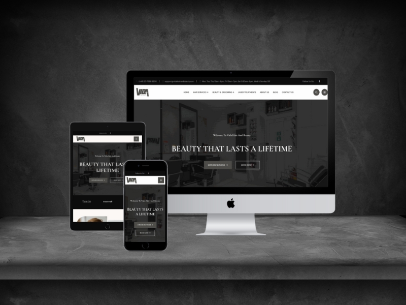

This healthcare website design project replaced an ageing site that patients did not trust with a clear, fast, mobile-first experience built around one job: making it obvious how to book an appointment.
Why healthcare website design is judged differently
A clinic website is judged before it is read. In Stanford's Web Credibility study of 2,684 people, 46.1% assessed a site's credibility partly on its overall visual design - layout, typography, font size and colour (Stanford Web Credibility Project).
In healthcare, where the visitor is often anxious and comparing providers side by side, that first impression decides whether they keep reading or return to the search results.
The provider's previous site did the opposite. Information sat several clicks deep, the layout looked dated on a phone, and there was no obvious next step - no visible way to request an appointment, ask a question, or confirm whether a service was even offered.
Mobile made it worse. Mobile devices account for about 53% of global web traffic (StatCounter, July 2026), and health queries skew higher still because people search in the moment. A desktop-first layout meant most visitors met the least usable version of the site.
How we approached the rebuild
We started from the questions patients actually arrive with rather than the structure the organisation uses internally: what do you treat, are you near me, what does a first visit involve, and how do I book?
Every page was then rebuilt around a single visible action. Service pages explain the treatment in plain language, set expectations for the first appointment, and end with one clear enquiry route rather than a phone number buried in the footer.
Speed and accessibility were treated as trust signals, not technical extras. A page that loads slowly or renders badly on an older phone reads as an organisation that is not careful - exactly the wrong signal for a healthcare provider.
What the new site includes
A mobile-first structure organised around patient questions, not internal departments
Service pages that explain each treatment in plain language
One clear enquiry route on every page, visible without scrolling on mobile
Accessible typography, colour contrast and tap targets throughout
An editable content structure the clinic team can maintain without a developer
Search-ready titles, descriptions and internal linking between related services
What changed
The provider reports a 67% increase in enquiries following the rebuild.
Beyond that figure, the change is structural. A visitor can now tell within a few seconds what the provider does, whether it is relevant to them, and how to take the next step - on the device they are actually holding.
Healthcare website design questions
How long does a healthcare website rebuild take?
After discovery we confirm scope, content needs and responsibilities, then work to a fixed timeline. Gathering clinical content is usually the longest step, not the build.
Do we need new photography and copy?
Not always. We work with what exists first and only recommend new material where the current version is actively costing trust.
Can our team update treatment pages ourselves?
Yes. Content lives in editable fields, so adding a treatment or changing opening hours does not require a developer.
Will the site meet accessibility expectations?
Contrast, tap targets, heading structure and keyboard navigation are built in from the start rather than retrofitted after launch.
What another clinic should take from this
Start with the four questions every patient arrives with and check that each one is answered above the fold on a phone. If any of them takes more than one tap to reach, that is where enquiries are being lost.
Resist the urge to reorganise the site around your departments. Patients do not know your internal structure and should not have to learn it in order to book.
Treat load time and readability as clinical signals. A site that feels careless suggests an organisation that is careless, and in healthcare that inference is expensive.
Where this work fits
OVELITHUB delivered this project as part of our website development work. You can also read how we approached Regents Kennels Premium Pet Breeding Website and ManCave Google Ads Search Campaign. Tell us what you are trying to solve and we will recommend a practical next step.