

Marketing & creative
How to Build a Brand Identity That Holds Up
A brand identity fails at the point of use, not at design. Build the system, rules and templates that keep it intact after the logo is signed off.

Six months after a rebrand, three logo files circulate in email. Sales built a deck in an unlicensed substitute typeface. Social uses a blue that looks close, the invoice uses another, and the website’s pale button text is difficult to read. Nobody knows which asset folder is current.
The identity did not fail in the design presentation. It failed at the point of use. A working brand identity is not a logo file; it is a system of language, visual decisions, accessibility constraints, reusable assets, templates, ownership and change control.
Shift part of the budget away from polishing one mark and toward the system that lets employees, partners and suppliers make recognizable work without asking a designer to decide everything again.
Where brand identities actually break
Identity breaks whenever a real user must improvise. The salesperson needs a proposal by noon. A new marketer cannot locate the correct photo. A printer asks for a color value that the guide never supplied. A developer needs hover and error colors, but the palette contains only five presentation swatches.
Each improvisation seems minor. Together they dilute recognition and create rework: files are corrected, assets rebuilt, campaigns delayed and accessibility defects repaired after release. Strict policing is not the answer. The answer is to make the correct choice easier than invention.
Before commissioning a project, ask what the team produces every week and who produces it. The required identity is partly a design problem and partly an operating-system problem.
Identity, brand and image are different
Brand identity is what the organization creates and can directly govern: name, language, logo, color, typography, imagery, motion, templates and rules.
Brand is the accumulated experience of what the organization promises and does: product, service, behavior, price, communication and delivery.
Brand image is what people perceive and remember. The business can influence it but cannot declare it by writing an adjective in a guideline.
This distinction changes the brief. A designer can produce identity assets. They cannot compensate for unreliable service or command customers to feel “trusted.” Measure whether the system is used consistently and whether people recognize it, then connect perception research with actual business behavior.
Make the strategic decisions before design
A useful creative brief answers:
- Who is the priority customer, in a real buying situation?
- What do we sell, and what category language will customers understand?
- Why are we the obvious choice for that customer, with credible proof?
- What promise can operations consistently keep?
- Which competitors or category conventions shape recognition?
- Where must the identity appear: web, product, app, packaging, documents, video, environments or uniforms?
- What must we never imply or resemble?
- What existing recognition, legal marks, domains or materials must be preserved?
Collect evidence: customer language, sales objections, search terms, service transcripts, competitive materials, current asset audit and stakeholder constraints. Separate a fact from an executive preference. “Our customers use the word managed” is evidence; “I like geometric logos” is taste.
A designer given no positioning can still make something attractive. It will be attractive and arbitrary. Approve the brief and decision owners before concepts begin.
Verbal identity comes first
Language tells the visual system what it must express. Define the name and its pronunciation, a short descriptor that says what the company does, and a messaging hierarchy:
- one-line proposition for the priority audience;
- primary customer outcome;
- three to five supporting capabilities;
- proof such as process, credentials, evidence or experience;
- objection responses and clear calls to action.
Then write tone rules as behavior. “Clear, calm and specific” is still abstract. Add examples: say “We will map the process and return a scoped plan” rather than “We deliver transformative solutions.” Say “Here is what is included” rather than “We do everything.” Define terms the company uses for its products, customers, plans and service stages.
Create do-and-do-not examples for headlines, sales copy, error messages, customer support and social posts. Verbal consistency is especially important when a distributed team or supplier produces content from a short brief.
Build a logo suite, not one logo
The suite normally needs a primary lockup, secondary or compact arrangement, standalone symbol or icon where recognition supports it, and single-color positive and reversed versions. Deliver vector masters plus practical web and office formats.
Define clear space, minimum reproduction size, background rules, alignment, permitted color versions and what not to alter. Show which version belongs in a site header, profile image, small favicon, document cover, video frame, embroidery or single-color print.
Test at the sizes and materials people will actually use. Fine lines that look elegant on a large screen may disappear in a small mark. A logo is not required to tell the company’s entire story; it needs to identify reliably within the broader system.
Choose color with contrast built in
Define a core recognition palette and a functional palette for text, backgrounds, borders, links, focus, success, warning and error. Supply values for relevant formats—such as HEX or RGB for screens and CMYK or spot specifications for print—while acknowledging that screens, paper, inks and production methods differ.
Specify approved pairings, not colors in isolation. A brand pink may work as a large surface and fail as small text on white. Keep data visualization and interface states distinguishable without relying on color alone. Test common forms, buttons, charts and content blocks before approval.
Do not justify choices with vague color-psychology claims. Color meanings vary with category, culture and context. Choose for differentiation, recognition, function, production and accessibility, then test with the intended audience.

Define a type scale and licensing scope
Use one or two type families unless a real language, editorial or product need justifies more. Define display, heading, body, label, caption and data styles with size, line height, weight, tracking and responsive behavior. Show hierarchy on a real article, form, deck and report.
Select fonts for legibility, available weights, language and character coverage, numerals, loading performance and compatibility with everyday authoring tools. Define fallbacks so documents remain usable when the primary font is unavailable.
Typeface licensing is usage-specific. A desktop licence may not cover website embedding, an app, server-generated documents, broadcast, social templates shared with contractors or use by every employee. Obtain the current licence from the foundry or authorized distributor, document permitted uses and seat counts, preserve purchase records, and provide a licensed fallback. Do not copy font files into a shared asset folder merely because the design agency supplied them.
Make imagery, icons and layout recognizable
Photography direction should describe subject, environment, behavior, light, crop, depth, color treatment and exclusions. “Authentic photos” is not actionable. “Real operators in a working environment, natural side light, calm editorial crop, visible process and no staged group smiles” is closer to a repeatable rule.
Define whether illustration is geometric, editorial, diagrammatic or absent; how icons handle stroke, corner, fill and optical size; and when stock assets are permitted. Include rights, model or property releases, attribution and AI-generated-asset review where relevant.
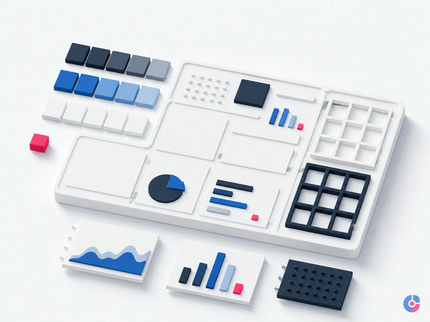
Set a layout grid, spacing scale, container widths, corner and border rules, alignment, density and intentional use of negative space. The test is whether a page or slide can look like the organization before the logo appears. Shared design tokens—named colors, type styles, spacing and components—connect brand decisions with web and product implementation.
Accessibility is a design constraint
Use the current Web Content Accessibility Guidelines 2.2 and applicable legal requirements for the product and market. For WCAG 2.2 Level AA, Success Criterion 1.4.3 requires at least 4.5:1 contrast for ordinary text and 3:1 for large-scale text, with stated exceptions. Success Criterion 1.4.11 requires 3:1 for visual information needed to identify interface components and states and for meaningful graphical objects.
Contrast is only one part of accessible identity. Specify visible keyboard focus, understandable link treatment, minimum practical type sizes, line spacing and measure, motion alternatives, text rather than unnecessary images of text, meaningful alt-text practice, scalable layouts and controls that do not communicate status by color alone.
A logo itself has a contrast exception under the text criterion, but that does not make pale brand text, navigation or buttons acceptable. Test components in their actual states: default, hover, focus, pressed, disabled, error and high-contrast settings where supported. Accessibility should influence palette and components before sign-off, not become a post-launch recoloring exercise.
Create guidelines people can use
A short practical guide beats a fifty-page book that nobody opens. The guide should explain the identity idea, verbal hierarchy, logo choice, color pairings, type styles, imagery, icons, layout, accessibility, asset location and approval route. Link rules to templates and examples.
An enforceable rule has a decision:
Decorative: “Use bold imagery that reflects our confidence.”
Enforceable: “Homepage and campaign images show one customer or operator completing a real task in a recognizable environment; use natural directional light, reserve space for the headline, and do not overlay text on a visually busy area.”
Show correct and incorrect examples, but explain the reason. Name the owner who resolves exceptions and how changes are published. The guide itself needs a version and review trigger.
Templates and asset management decide survival
Build the formats the team uses first:
- presentation deck with title, section, content, data and case-study slides;
- proposal or one-page sales document;
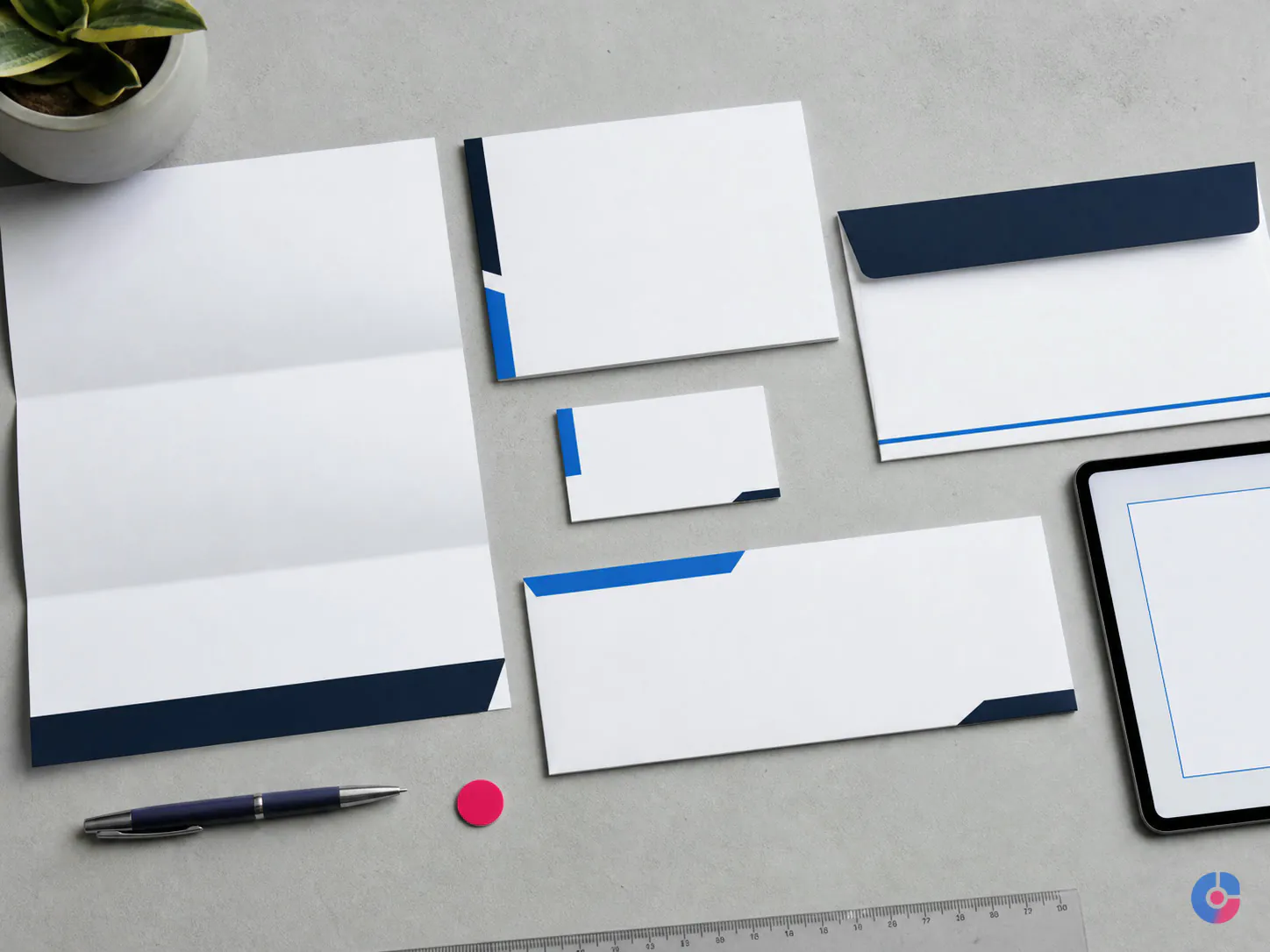
- letter, report and document cover;
- social post, story or video-cover formats;
- email header and signature;
- invoice, quotation or approved business form;
- website or landing-page components for recurring content.
Provide locked structure where change would break the identity and flexible fields where users need speed. Include accessible text styles, image-crop placeholders, character guidance and export settings. Test with a salesperson, marketer and administrator who did not build the template.
Maintain one source of truth with folders for masters, exports, templates, licensed assets, archive and guidance. Use names that identify asset, orientation, color, language, size and version. Restrict master editing while keeping everyday exports easy to find. Provide a request form for a missing format so people do not improvise silently.
For ongoing campaign production after the system is established, a graphic design assistant for marketing teams can operate templates and route exceptions without redefining the identity.
To scope strategy, verbal rules, visual system, accessibility, templates and ownership as one deliverable, book a brand identity scoping call.
Roll out without losing existing recognition
Inventory every touchpoint and rank it by audience, traffic, risk, production lead time and remaining stock. Launch internally first: explain what changed, why, where assets live and how to ask for help. Train frequent producers using real tasks.
Update high-traffic digital properties and sales materials next, then campaigns, documents, product, packaging, signage and long-tail operational items. Coordinate domains, profile handles, email, paid media, templates and tracking. Use an approved transition lockup or explanatory message when the name or visual change is substantial.
Do not destroy usable packaging or signage solely for visual purity without considering cost and waste. Define a transition window. If existing recognition is valuable, preserve distinctive elements or sequence the change so customers can connect old and new.
Measure consistency and recognition
Measure proxies the team can act on:
- live-asset compliance: sample websites, decks, ads, documents and profiles against a concise checklist;
- template adoption: share of recurring assets created from approved current templates;
- asset retrieval: time or requests required to locate the right file;
- correction and exception rate: brand rework and reasons;
- unprompted recognition: show representative, logo-hidden assets in a carefully designed survey and ask who produced them;
- cross-channel consistency: quarterly review of the priority customer journey.
A recognition test needs a relevant sample, comparison set and stable method. Do not interpret a small convenience survey as market-wide brand equity. Use findings to improve distinctive cues, templates and distribution.
Refresh or rebrand
A refresh preserves the strategic meaning and recognizable equity while improving execution: refined logo, accessible colors, updated typography, photography and templates. Choose it when the business remains fundamentally the same and the system is inconsistent or dated.
A rebrand changes what the organization is known for and may include name, positioning, architecture, promise and identity. It should follow a real strategic shift such as changed market, offering, ownership, reputation or audience—not a leader’s fatigue with the logo.
Audit recognition, legal rights, customer language, digital and physical transition cost, search impact and operational readiness before choosing. A dramatic change without business change spends equity and budget to solve boredom.
The mistakes that cost the most
- designing a logo before deciding positioning and audience;
- choosing palette colors before testing accessible combinations and production;
- licensing fonts for one use while deploying them across web, desktop, app and suppliers;
- delivering files without templates for recurring work;
- storing masters in a designer’s private account;
- launching externally before employees know where the system lives;
- having no identity owner, exception route or review cadence.
If the budget is limited, buy a minimum viable system: approved proposition and tone rules, practical logo suite, accessible core and functional palette, licensed typography with fallbacks, image direction, a short guide, master asset library and the two most-used templates. Add secondary formats after observing real demand. “Just a logo” is cheap only until everyone must invent the missing system.
Bring current assets, customer evidence, competitor set, production inventory, team workflows, accessibility target, rights and rollout constraints. We will define the minimum viable system and staged deliverables. For a new-company rollout, compare digital business launching; for recurring execution, review a graphic design assistant, or book a free consultation.
Keep reading
Related insights

WordPress vs Custom CMS Development
A custom CMS buys control and a permanent maintenance bill. Compare both against your content model, team and five-year plan before you…

BPO Services for Digital Marketing: Benefits
Marketing teams stall on execution, not ideas. See which marketing functions a BPO model absorbs, what it returns in hours, and where…

What SEO Services Actually Deliver
SEO is four separate disciplines sold as one word. See what each part does, what results it can produce, and how to…